

 中文 (香港)
Imagine this situation.
You wake up, check your calendar and you realize it’s your mother’s birthday tomorrow and you’ve forgotten to buy her a present.
Luckily, you still have time to go to a jewelry store and get her a nice pair of earrings. The problem is, you have no idea where you can get them. You get up, make a coffee and turn your computer on.
Google gives you a couple of results but you click the first one anyways. Once it loads, you see a website that looks like that:
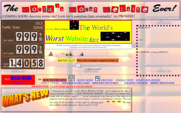
For the very first moment, you think that you were attacked by a virus with no taste in aesthetics or it’s an awful popup advertisement.
Luckily, remnants of common sense suggest to check the website URL and you see that you’re on the jewelry store’s website.
Jikes!
You turn the computer off with a relief, thinking that if the company’s website looks so tasteless, their jewelry can’t be any better. You decide to buy your mother a box of chocolates and a book.
This short story of a website visitor who was scared away by a horribly bad website is much more common than you think.
Although above example is only a representation of a really, really bad website, from time to time we come across pages that look like they were designed by the Mad Hatter. And I’m not only talking about company websites, I’m also talking about auction pages.
So, if you’re wondering what makes a good website, I’m going to give you a handful of design tips on how to create a fetching, user-friendly and effective website.
Design tip #1: Purpose
Each page of your website should have a clear purpose. It will most probably sell your products and services, generate leads or build your brand.
Ask yourself what is your customer going to look for on your website. Will it be information, purchase, entertainment?
It’s easy if your website is supposed to entertain. You can share pictures, videos, podcasts or humorous art but you should remember to update it often.
If you’re creating an informational website, it means that its users will look for learning something new or understanding some topics better. Such websites should contain a knowledge base, tips and trick, “how to” guides or product pictures.
But if you’re creating an e-commerce website, you need to remember that this website is selling. This means that you need to have a nice design, high-quality pictures and persuasive copy with clear information about the benefits customer is going to get from you.
Design tip #2: Visuals
Your website needs to be eye-catchy so visitors want to explore it. If it’s unattractive and old-fashioned, it might mean that you don’t care about improving your product or services.
Even if you’re not a web designer, you should have an impact on how your website is going to look. The best way to figure out what you want is to check your competitor’s websites and think about what you like and what would fit your brand’s personality.
You can also look for inspiration on websites like Awwwards that show best website examples of graphic design. It will let you get familiar with web design trends and form an opinion about what you like or dislike.
If you want to find pictures that are free to commercial use, you can check Pixabay, Unsplash or Flickr. Don’t rely on stock photos too much though, I’d recommend sticking to something that looks more natural.
Don’t use huge images if you don’t want your website to be slow and keep in mind to upload them in PNG or JPG format. Always use graphics and pictures that fit the content and, for heaven’s sake, don’t use anything that blinks, flashes or rotates.
Remember about whitespace so the website looks clear and aesthetic.
Sometimes less is more!
Try to limit the number of different fonts to 3 and stick to the standard font families. I know that sticking to Helvetica or Arial might sound boring, but thanks to this your website will format correctly on more browsers!
Design tip #3: Relevant, original content
None of your website visitors will have time to read essays about your products or services so remember about the main rule of content writing: clear communication.
Once your website visitors enters your website, make sure they know who you are, they know what you do and what kind of benefits they can get if they decide to become your customers.
Under “clear communication” I also understand a couple of less obvious things: the use of headlines and subheadings, bullet points and paragraphs.
Design tip #4: Clear website navigation
Navigation is about how easy it is for people to take action and move around your website.
You can have the most beautiful website ever, but if your customers won’t be able to find the information they are looking for or get confused while encountering obstacles in the purchase process, your website won’t sell.
Think about creating a logical page hierarchy with clickable buttons and categories. Also, remember about the “three click rule” of clear navigation. This rule means that users should be able to find the information they are looking for within three clicks.
There is also a rule called the F-shaped pattern.
Most of what people see is in the top and left of the screen and we should put the most important information there. The right side of the screen is rarely explored, so we should not place there any important information, buttons or CTAs.
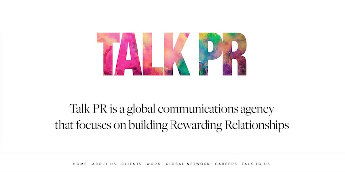
Your website is your business card
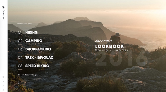
You have probably seen at least a couple of really seductive websites that you didn’t want to leave.
Maybe you liked the gallery of Mulberry handbags, or maybe you couldn’t stop browsing through Quechua jackets, trying to decide which one you like the most. There was something that made those websites awesome: a design.
A good website grabs your attention and evokes emotions making you want to stay. It’s intuitive, easy to use and gives you a clear reason why you want to browse it. It has clear copy, clear CTAs and nice visuals.
But a good website is something that is not only made for a customer. Your website reflects you as a business owner and professional.
Your website is your company’s business card as people judge your brand based on what they can see on the Internet. That’s why, if you’re wondering if it makes sense to spend your time and efforts on creating an awesome website, let me tell you: it does.